
A dining table can be beautifully made and still feel wrong in a room. A sofa can have the right silhouette yet interrupt the path from kitchen to terrace. These are rarely furniture problems. They are space planning problems: decisions about proportion, movement, sightlines, and use that determine whether an interior feels composed or merely furnished.
For a major renovation, custom home, city residence, ADU, or creative workplace, planning is the point at which architecture and daily life begin to meet. It establishes the discipline beneath a quiet interior. Materials, lighting, and furnishings can refine that framework, but they cannot reliably correct a room that is too narrow to move through, a kitchen disconnected from its social center, or a primary suite that offers no privacy from the rest of the house.
What Space Planning Actually Solves
Space planning is not simply assigning a name to every room. It considers how rooms relate to one another, what happens within them, and what should remain out of view. It asks practical questions early enough for the answers to shape the architecture: Where do guests arrive? Where do bags, coats, and shoes land? Can two people cook without competing for the same aisle? Does a home office have visual and acoustic separation when needed?
The best plans also account for less measurable experiences. A living room may be technically generous but feel exposed if it opens directly to an entry. A compact apartment can feel expansive when the sequence of spaces is clear, daylight travels through the plan, and each zone has a distinct purpose. In a commercial setting, a reception area may need to introduce a brand while still giving staff a calm, functional place to work.
This is why square footage alone is a poor measure of success. A larger footprint can create wasteful corridors and awkward leftover corners. A smaller one can feel highly livable when circulation is efficient and storage is integrated from the beginning. The goal is not to fill every available area. It is to give each area a reason to exist.
Space Planning Begins With Real Life
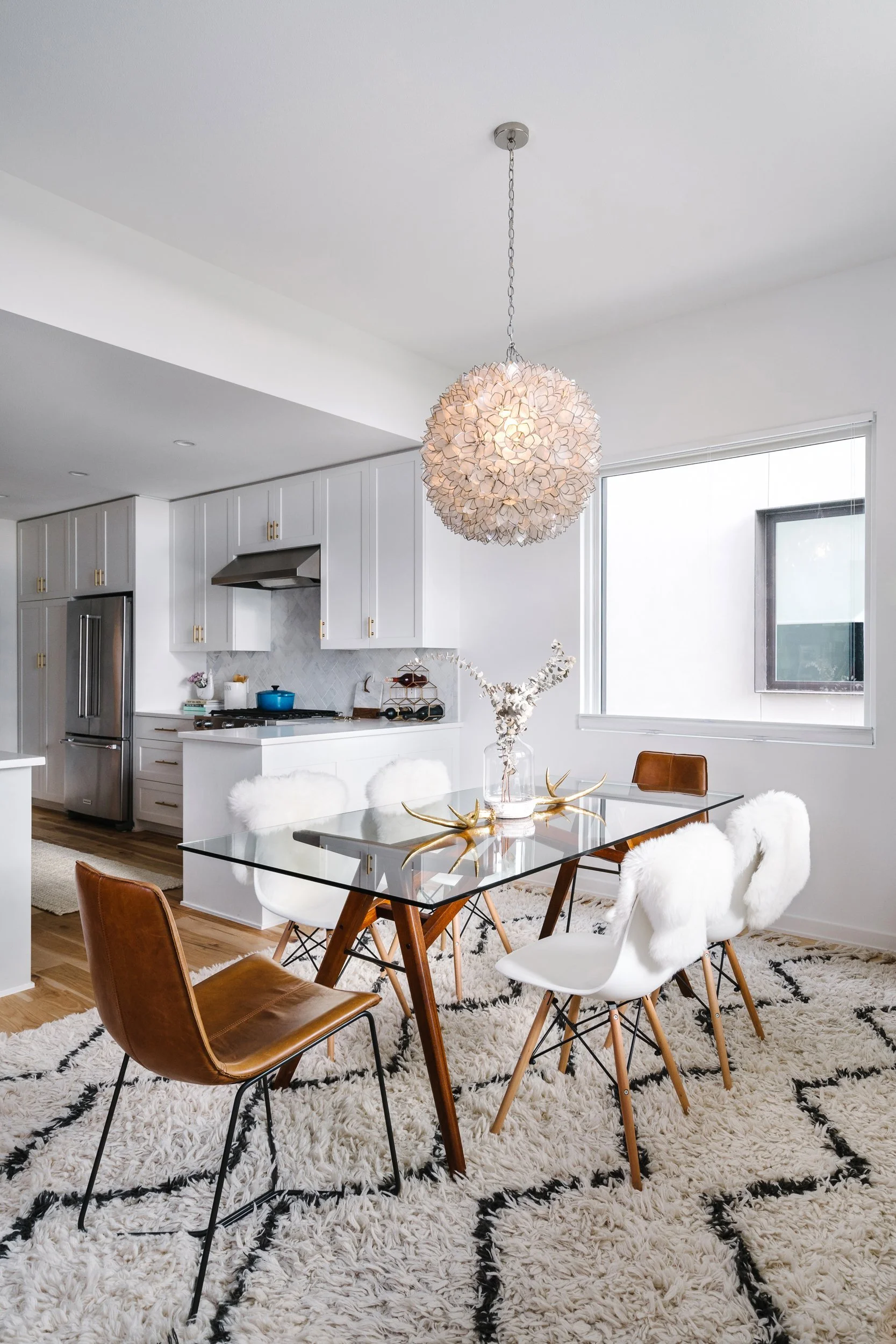
Before layouts are tested, the design team needs a clear picture of how a client lives. That means more than identifying the number of bedrooms or requesting an open kitchen. It means understanding rhythms: early mornings, school-day departures, frequent entertaining, quiet weekends, visiting family, remote work, pets, hobbies, and the degree of visual order a household wants to maintain.
A family that hosts large dinners may need a dining room that expands comfortably, with a direct relationship to the kitchen and outdoor living. An executive who spends much of the week on video calls may need an office with controlled background views, proper task lighting, and a door that closes. For a second unit, flexibility may be more valuable than a formally separated room, particularly when one space must serve as guest room, study, and occasional retreat.
There are trade-offs. An entirely open plan encourages light and sociability, but it can amplify noise, expose kitchen activity, and reduce wall space for art or storage. More defined rooms create privacy and intimacy, though they require careful attention to light and circulation. Neither approach is inherently more contemporary. The appropriate choice depends on the property, its setting, and the people who occupy it.
Start With Adjacencies, Not Furniture
Furniture plans are essential, but they should not be the first decision. Begin with adjacencies: which functions belong near each other, which need separation, and which benefit from a visual connection.
In a well-resolved home, the kitchen often has a close relationship to dining, pantry storage, and outdoor entertaining. Bedrooms benefit from distance from active social spaces, particularly in homes with varied schedules. A mudroom or entry should relieve the main living areas of daily clutter rather than becoming a decorative afterthought. In a commercial creative environment, client-facing zones may require a more deliberate threshold from production, storage, and focused work areas.
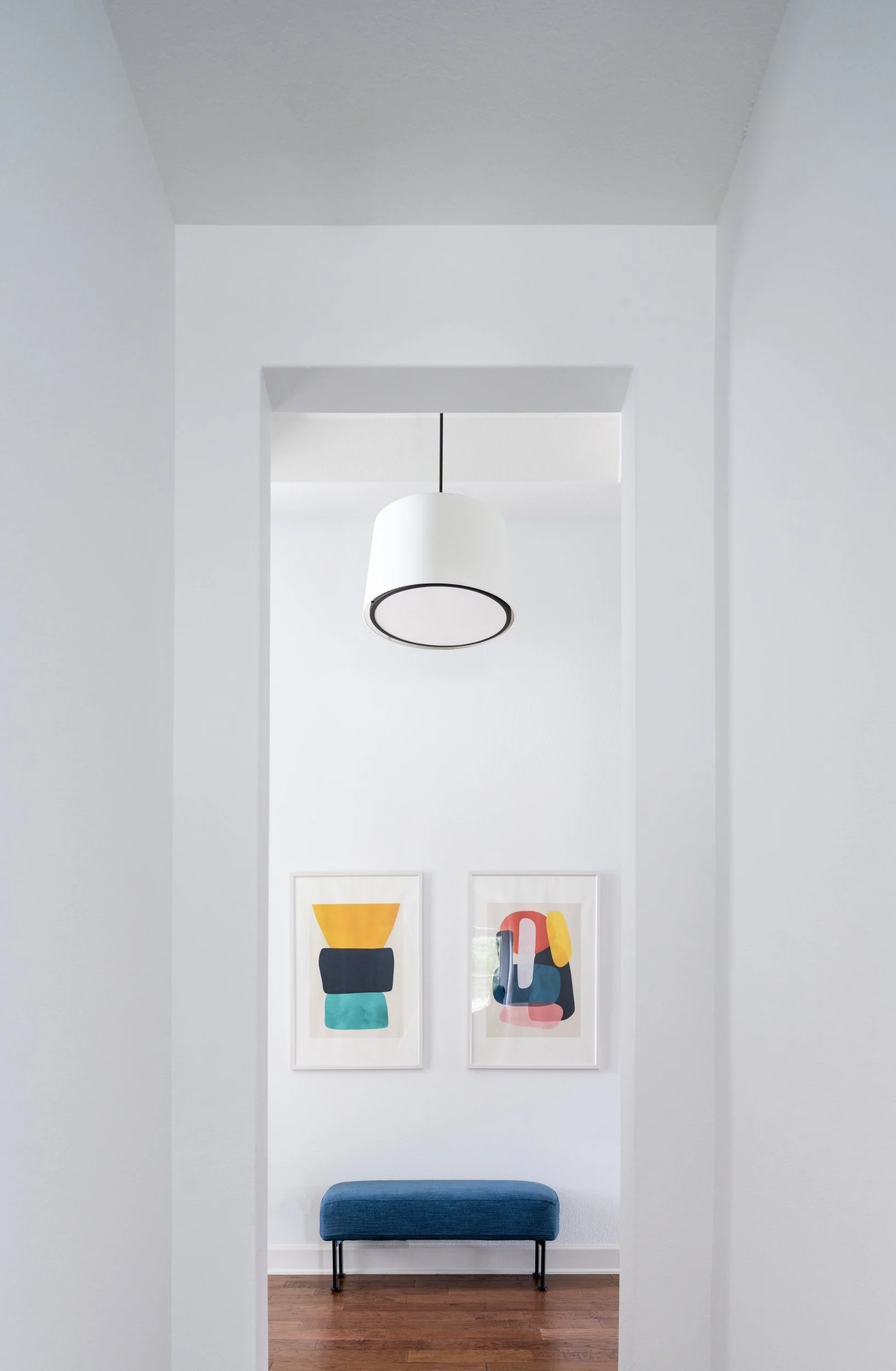
These relationships form a sequence. A plan should allow the house to reveal itself at a measured pace rather than presenting every function at once. That sense of progression is especially valuable in urban residences and compact remodels, where a carefully framed view or partial separation can make a modest footprint feel more considered.
Design the Paths People Actually Take
Circulation is often discussed in dimensions, but it is also about ease. The route from garage to kitchen should accommodate groceries. The path around a bed should not force someone to turn sideways. Doors should open without colliding with cabinetry, seating, or another person moving through the room.
Good circulation has a visual benefit as well. When primary paths are clear, furniture can sit with confidence rather than being pushed to the perimeter simply to create passage. This is one reason floating a sofa, positioning a dining table away from a wall, or using a low console as a subtle divider can improve a room. The arrangement establishes zones without resorting to unnecessary partitions.
Not every room requires a direct route through it. In fact, protecting certain spaces from through-traffic can make them more useful. A reading area, primary bedroom, or dedicated office often benefits from being slightly removed from the home’s busiest path. The decision should be intentional, not accidental.
Proportion Is the Quiet Work of a Good Plan
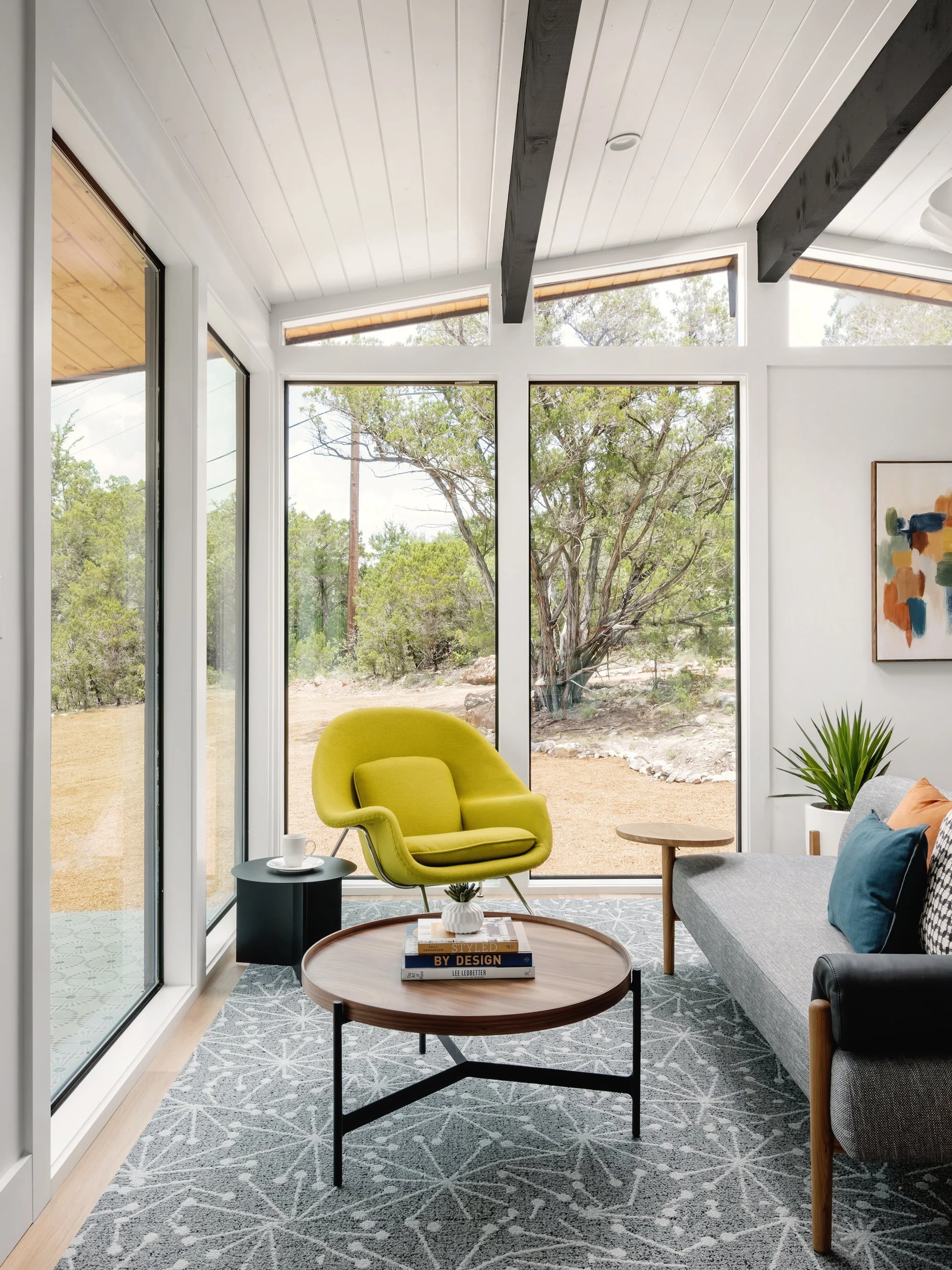
A room can be large and still lack generosity. Proportion comes from the relationship between the room’s dimensions, ceiling height, openings, and intended furnishings. It determines whether a large sectional feels anchored or stranded, whether a dining table has enough breathing room, and whether a kitchen island becomes a gathering point rather than an obstacle.
This is where plans should be tested with real dimensions rather than symbolic blocks. A king bed, dining chairs pulled back from a table, open dishwasher doors, kitchen stools, and storage drawers all require space in use, not simply at rest. Designing only for the object itself produces rooms that look orderly on paper and feel constrained in daily life.
Ceiling height and window placement deserve equal attention. In a California condominium, a limited footprint may be balanced by expansive glazing and carefully preserved sightlines. In an Austin renovation, a new opening to a shaded landscape may change the entire hierarchy of a living space. The plan should make room for light to travel and for the eye to rest on something beyond the immediate function of the room.
Give Storage a Place Before It Becomes a Problem
Visual restraint depends on functional capacity. Minimal interiors require more planning, not less, because everyday objects need deliberate places to go. Coats, charging cables, cleaning supplies, children’s gear, linens, pantry items, and work materials all influence the plan.
The most useful storage is often close to the moment of use: a concealed cabinet near the entry, deep drawers where food is prepared, a linen closet outside the bath, or integrated millwork in an office. Distributed storage can be more effective than a single oversized closet because it supports the habits that create clutter in the first place.
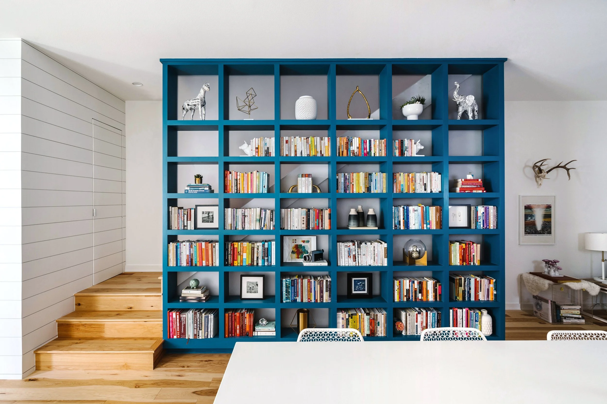
Built-ins should not be added merely to occupy a blank wall. Their proportions, depth, and relationship to adjacent architecture matter. A well-placed storage element can create an entry sequence, define a dining zone, or conceal the operational parts of a workspace. An overbuilt one can make a room feel heavy and inflexible.
Plans Need to Change as the Project Becomes More Specific
Early planning is necessarily broad. It establishes priorities and tests the major moves: addition versus renovation, open versus enclosed, one large living volume versus several smaller rooms. As the project develops, the plan becomes more exact. Window locations, structural conditions, mechanical systems, cabinetry, lighting, and furniture all refine the original idea.
This is not a failure of the first plan. It is the work of design. A strong concept must be able to absorb new information without losing its clarity. Sometimes a structural constraint suggests a better location for a kitchen wall. Sometimes an existing view deserves greater emphasis than originally expected. Sometimes the client’s wish for a larger island has to yield to the circulation that makes the kitchen work.
The most successful space planning holds a firm overall logic while remaining responsive to the property. It respects the character of an atomic ranch, the compact efficiency of a San Francisco residence, or the indoor-outdoor cadence of a Texas home without applying a fixed formula.
Before selecting the final stone, fixture, or upholstery, spend time walking the plan in your mind. Imagine arriving with groceries, hosting six friends, closing the door for a call, making breakfast before sunrise, and putting the house back in order at the end of the day. The right plan will not announce itself. It will simply make those moments feel considered.
Planning a renovation or full home design in the San Francisco Bay Area or Austin? Our Bay Area interior design team works across San Francisco, Marin, the Peninsula and the East Bay, and our Austin studio serves Central Texas. Book a discovery call to talk through your project.