
A compelling room can look almost effortless in a photograph. That is precisely why modern house interior design photos are useful, and why they can also be misleading. The strongest images capture a quiet visual order: architecture, furnishings, light, and material all appear to belong to the same idea. What they do not immediately show is the series of decisions that created that order.
For a homeowner planning a substantial renovation or new residence, the value of reference imagery is not in copying a sofa, a paint color, or a single photogenic corner. It is in learning how to identify the spatial principles that make a room feel resolved. The difference matters. A home built from isolated visual references can feel assembled. A home built around proportion, circulation, and a clear material language feels considered from the first step inside.
What Modern House Interior Design Photos Actually Reveal
The most informative photos show relationships rather than objects. In a well-composed living room, the eye may first register a sculptural chair or an expansive view. Look longer and other decisions become apparent: the rug establishes a measured field beneath the seating, the coffee table holds a deliberate distance from the sofa, and the art is scaled to the wall rather than used to fill empty space.
Modern interiors often rely on restraint, so proportion carries unusual weight. A room with few visible elements leaves little room for a poorly scaled fixture, an undersized rug, or a crowded furniture plan. The apparent simplicity of a minimal interior is often the result of careful editing, not a lack of decisions.
Photos also reveal how a project addresses its architecture. A Pacific Heights apartment may use pale oak, plaster, and tailored upholstery to soften the formality of an urban setting. An Austin ranch renovation may retain a stronger connection to the landscape through low profiles, warmer woods, and glazing that extends the visual field outdoors. Neither approach is inherently more modern. Each uses a contemporary vocabulary in response to place.
Read the Room Before Saving the Image
When reviewing images for a future project, begin with the envelope of the room. Notice ceiling height, window placement, wall length, and where daylight enters. A dining room that feels generous in a photograph may have a ceiling two feet higher than yours, or windows positioned to give it an even wash of light. Those conditions influence every selection that follows.
Then consider circulation. Can people move around the seating area without cutting through it? Is the dining table centered within the room or simply centered in the frame? Does the kitchen have enough clear floor area for more than one person to work comfortably? Professional photography tends to remove visual interruptions, but a successful house must accommodate daily movement, bags, pets, children, guests, and the rituals that make a space lived in.
This is where a reference image should prompt questions rather than provide answers. If you admire a nearly empty kitchen, ask what allows it to remain clear. The answer may be a walk-in pantry, integrated appliances, concealed charging drawers, or a utility room beyond the camera's view. The aesthetic is real, but its calm is usually supported by planning that is invisible in the final image.
Light Is Part of the Design, Not a Finishing Layer
Natural light can make a restrained palette feel dimensional. It gives depth to limewash, reveals the grain in white oak, and changes the temperature of stone over the course of a day. In photographs, pay attention to the direction of shadows and the contrast at windows. Bright, diffused light supports a soft and minimal atmosphere; stronger, directional light can give a room more graphic definition.
Artificial lighting deserves the same scrutiny. A room may look quietly illuminated because light sources have been layered rather than concentrated in one central fixture. Recessed architectural lighting, decorative pendants, wall lights, and low-level lamps each serve different purposes. The best schemes provide enough light to live comfortably while preserving shadow, texture, and visual depth at night.
Materials Should Hold Up Beyond the Photograph
A modern interior can look highly refined with only a few materials, but those materials must work hard. Warm wood can offset the cool precision of stone. Matte metal can give a kitchen definition without introducing unnecessary shine. Upholstery contributes softness, acoustic control, and a necessary sense of ease.
Images are particularly useful for studying contrast. Notice whether the project pairs smooth and tactile surfaces, light and dark values, or refined finishes with more elemental ones. A home rendered entirely in pale, hard, smooth materials can feel stark in person, especially under bright sun. Conversely, an overabundance of texture can compromise the clarity that makes modern spaces feel calm.
Durability is the necessary counterpoint to visual appeal. Honed stone may suit a kitchen beautifully, but it will develop a lived-in patina. Natural wood flooring can be repaired and renewed, though it will show character over time. Lacquered cabinetry offers a crisp finish but may not be the right choice for every active household. Good design does not deny these trade-offs. It selects materials whose aging process fits the way a client intends to live.
The Difference Between Minimal and Underfurnished
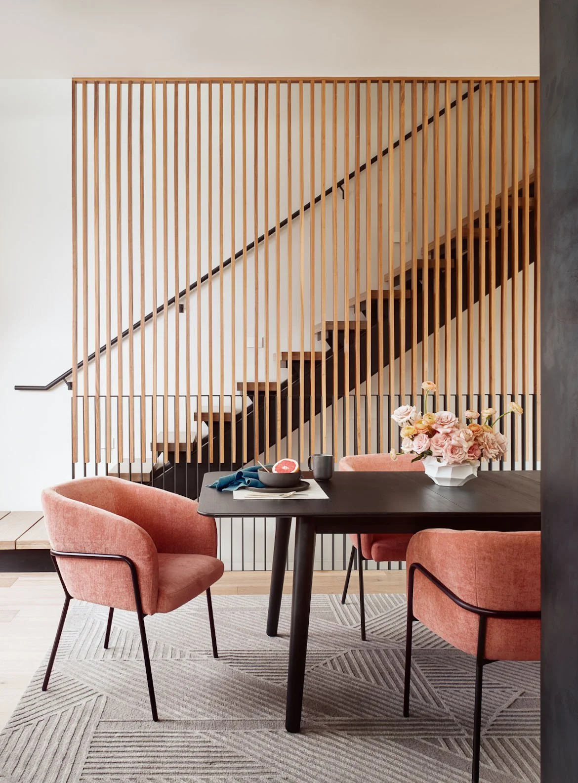
One of the recurring lessons in modern house interior design photos is that visual restraint is not the same as absence. A minimal room still needs enough furniture to support conversation, rest, reading, storage, and gathering. It also needs moments of warmth and personal distinction.
The strongest contemporary homes tend to edit rather than erase. They may use fewer furnishings, but each piece has a defined role and a clear relationship to the architecture. A long, low sofa might reinforce a horizontal view line. A substantial dining table might anchor an open plan. A single large artwork can create more presence than a crowded gallery wall when it is scaled with confidence.
This is especially relevant in open-plan homes, where every selection is visible from several vantage points. Repetition can create coherence: related woods, a consistent metal finish, or a controlled range of textiles. Repetition should not become uniformity, however. A room needs enough tonal variation and texture to feel inhabited rather than staged.
Use Reference Images to Define Priorities
A useful image library is organized by the qualities you want to achieve, not by room type alone. You may be drawn to the way daylight moves across a plaster wall, the stillness of a low-slung living room, or the precision of a concealed kitchen. Group those images by the underlying idea. Patterns will emerge quickly.
It can help to separate references into three categories: architectural conditions, material atmosphere, and furniture character. Architectural conditions include window walls, ceiling planes, built-ins, and transitions between rooms. Material atmosphere covers the balance of wood, stone, metal, paint, and textiles. Furniture character concerns scale, silhouette, and comfort. Keeping these categories distinct prevents a common mistake: asking one photograph to solve every design question.
Be equally clear about what does not translate. A dramatic black kitchen may be compelling in a large, light-filled home and oppressive in a narrow condominium. An all-white palette may feel serene in a fog-softened Bay Area setting yet appear washed out under intense Texas sun. Context changes the outcome. The aim is not to reproduce a photograph, but to carry its governing logic into a home with different dimensions, climate, and routines.

A More Useful Standard for Inspiration
The best interiors photograph well because they work well before the camera arrives. Their beauty comes from an alignment between the plan, the architecture, the materials, and the people who occupy them. There is room for personal objects, for changing light, and for the mild disorder of ordinary life.
As you collect imagery, favor rooms that still feel convincing after the initial impression fades. Look for the choices that would matter on a weekday morning as much as they do in a finished photograph: a place for keys, a comfortable seat near a window, storage that protects visual calm, and materials that become better known with use. That is where a reference image becomes the beginning of a home with lasting presence.